.png)
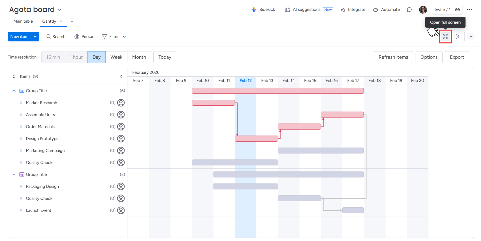
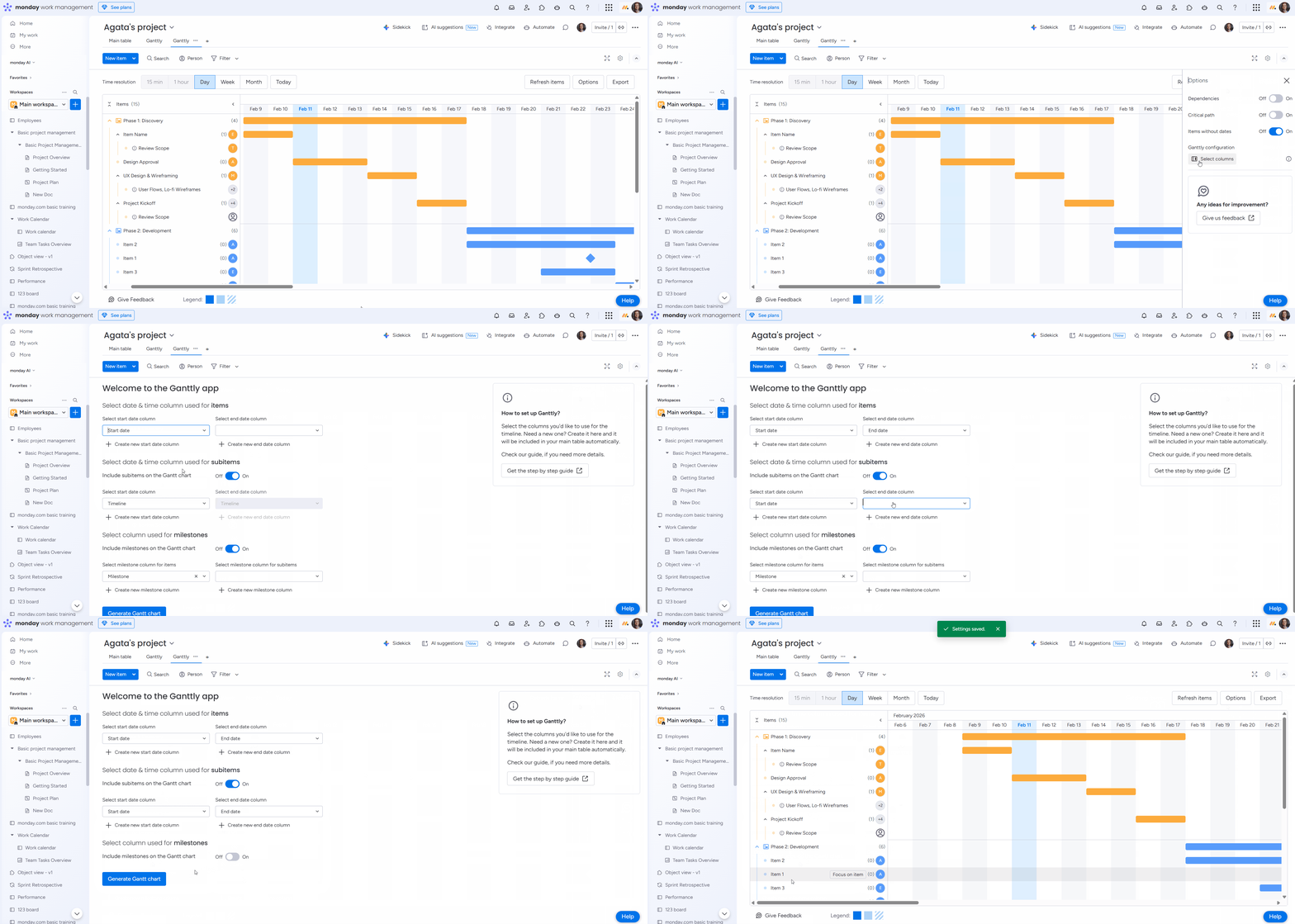
Once your columns are mapped, Ganttly generates your Gantt chart.
View modes
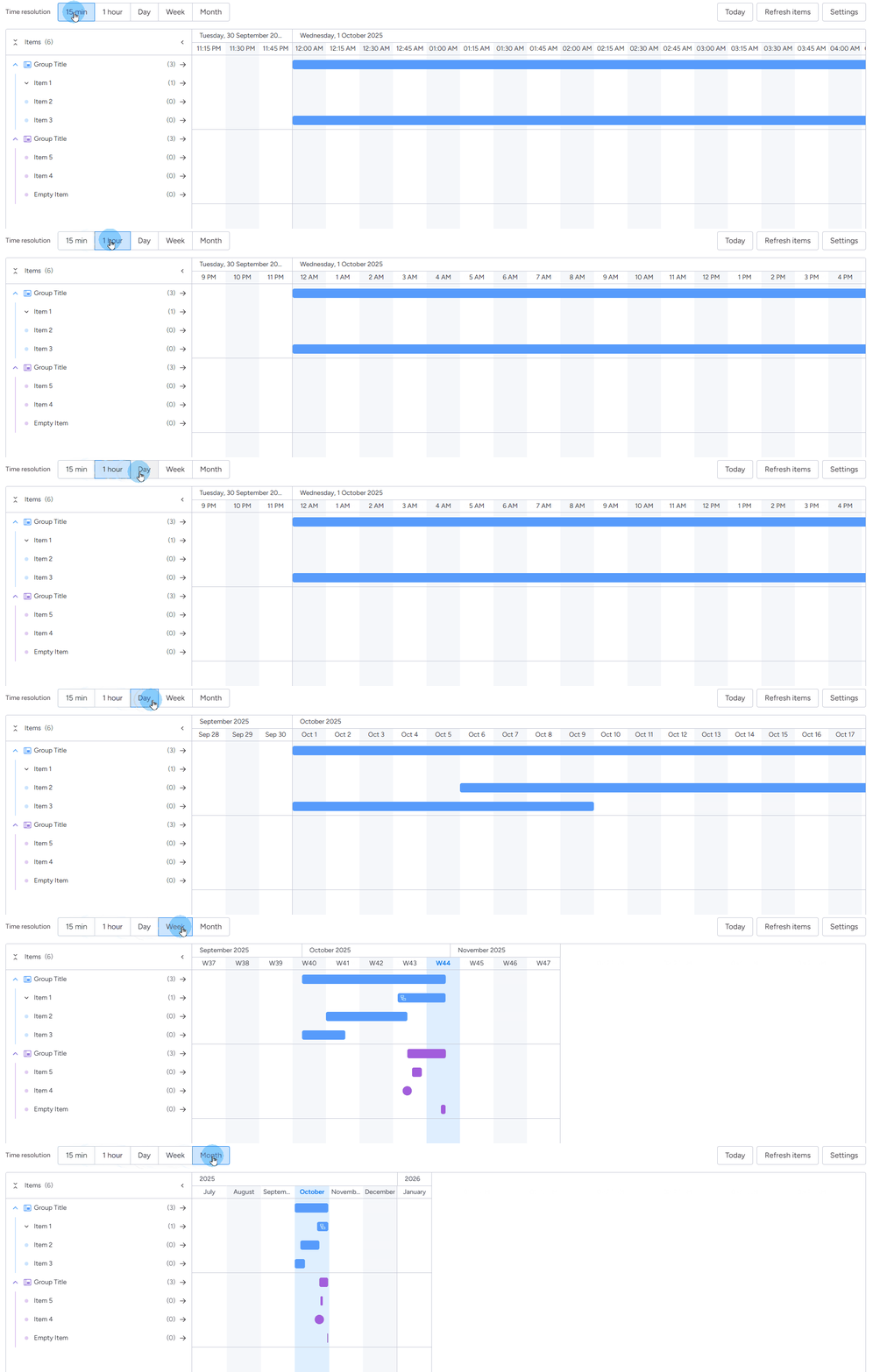
You can view your project timeline in the following views:
-
Hourly
-
Daily
-
Weekly
-
Monthly
Structure of the chart
Each item or subitem appears as a bar on the chart. The bar’s position and length reflect the start and end dates from your mapped columns.
.png?cb=e268949d639b93625d8abc691836bc26)
On the left side, you’ll see a list of item names, aligned with their bars.
Items are grouped just like on your board. Every group has a bar that represents the time between its first and last items.
.png?cb=4afe84590be49b0c20084e8fdc245c2d)
Groups with no dated items won’t appear on the chart.
If you’ve configured columns for subitems in your settings, those subitems will appear on the Gantt chart as transparent bars beneath their parent item. You can collapse or expand these subitems under the parent item at any time.
For step-by-step instructions on adding subitems to your Gantt chart, see the How to set up a Gantt chart section.
.png?cb=83f3540955cae9ae0145b039389b2117)
If a parent item has no dates but its subitems do, the parent item will appear on the list as a hatched bar. This bar is drawn from the earliest start date to the latest end date of its subitems, functioning similarly to how a group summary bar is displayed.
.png?cb=37c1c2db5cba14baaedaab7057351772)
People icons
Ganttly helps you track who is responsible for each task by displaying Person column icons directly on the chart. User icons from your Person columns are displayed alongside their respective tasks.
%20(1).png?cb=32ebfba9803a6da0b239dcdf82af759f)
If your board utilizes multiple People columns, Ganttly will automatically pull and display all assignees from every column for complete visibility.
%20(3).png?cb=982d1dff559085c747bcd6fa6eb0555e)
If an item has no one assigned in the Person columns, it will be displayed with an empty icon.
%20(2).png?cb=5458e798f4c5a0faba54ea1fc3f84b58)
Milestones
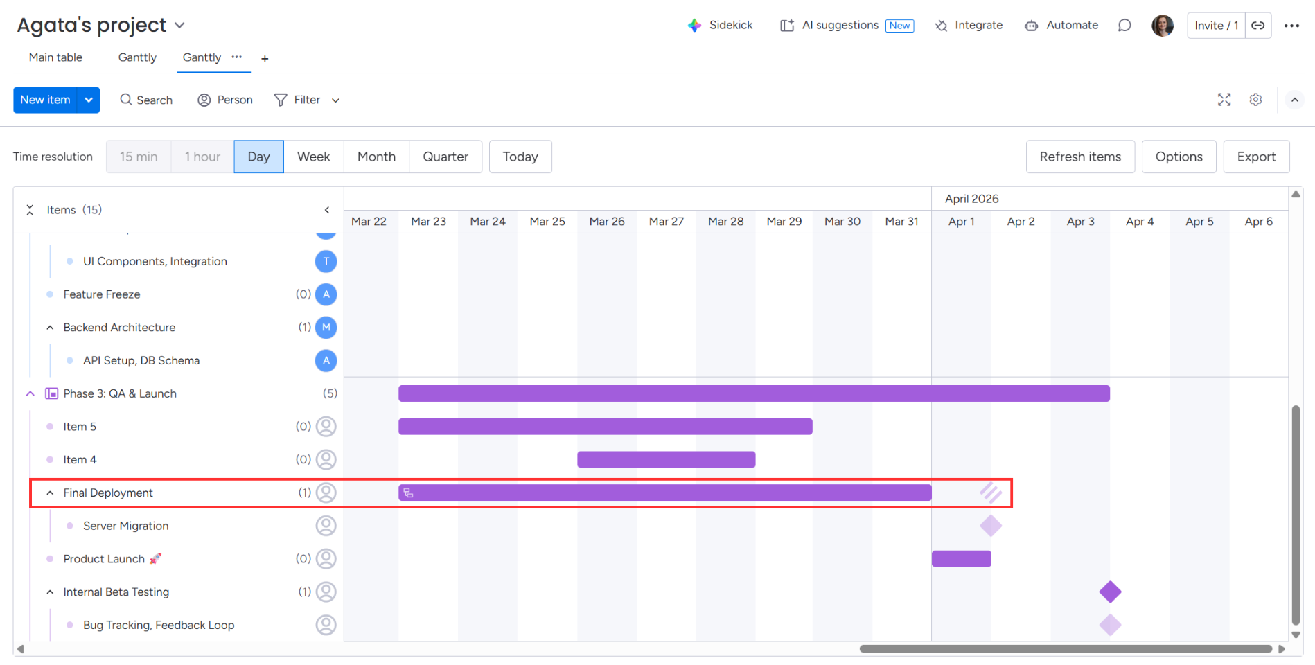
Items marked as milestones are depicted as diamonds. Each diamond is colored according to the group it belongs to on your board.
If a diamond appears at the end of a hatched bar, it indicates the parent item has no dates of its own and is inheriting its timeline from its subtasks.
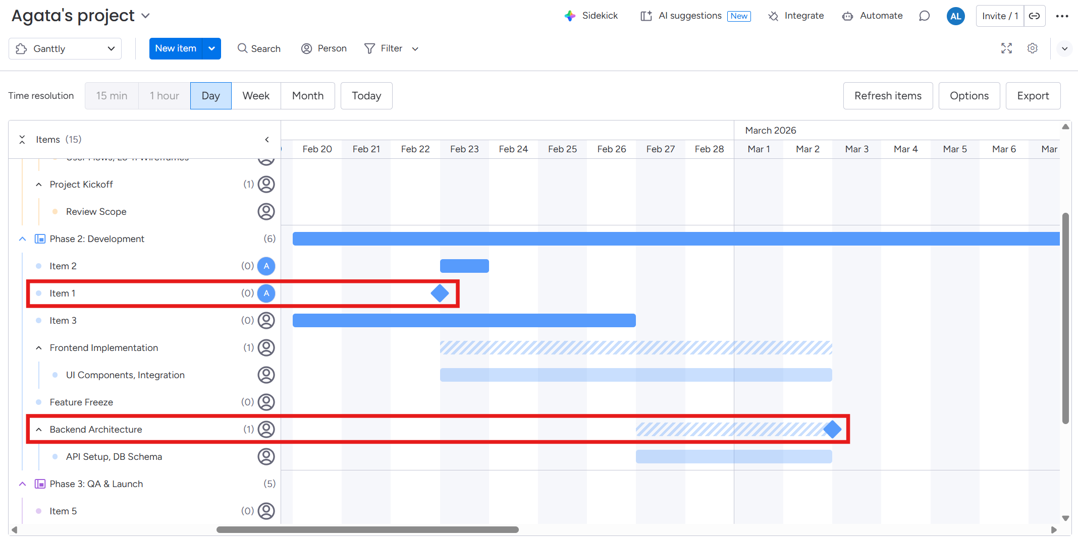
If you’ve configured milestones for subitems in your settings, those milestones will appear on the Gantt chart as transparent diamonds beneath their parent item.
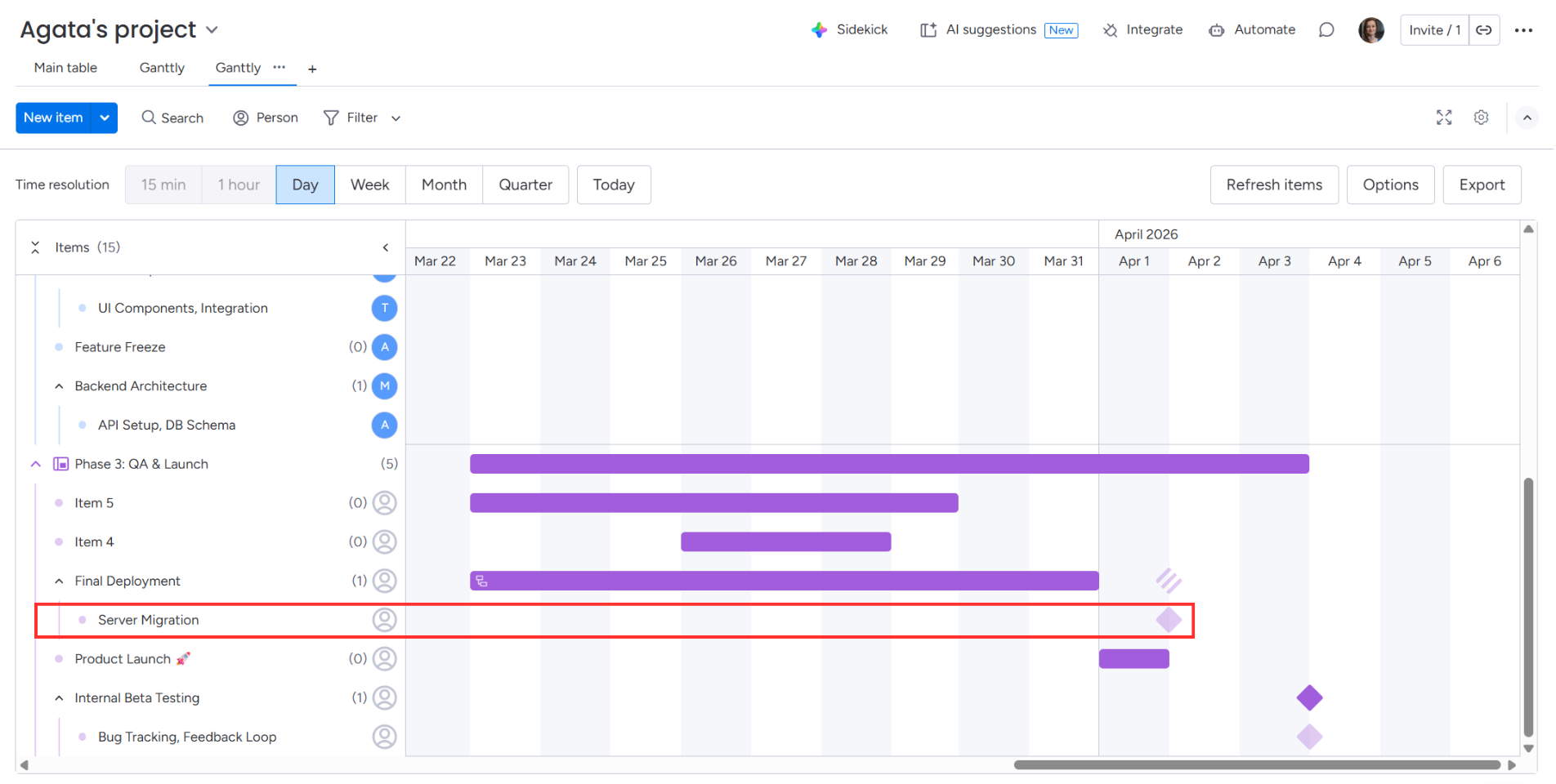
A hatched diamond indicates that the milestone belongs to one of the item's subitems, mirroring how hatched bars represent subitem date ranges.
Dependencies
Only Pro & Enterprise monday.com users can set up dependencies between items on
their board.
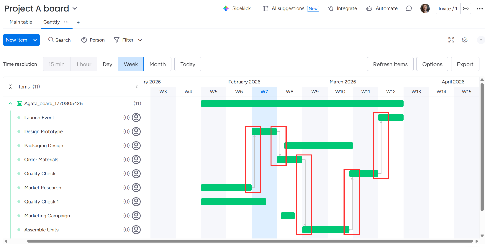
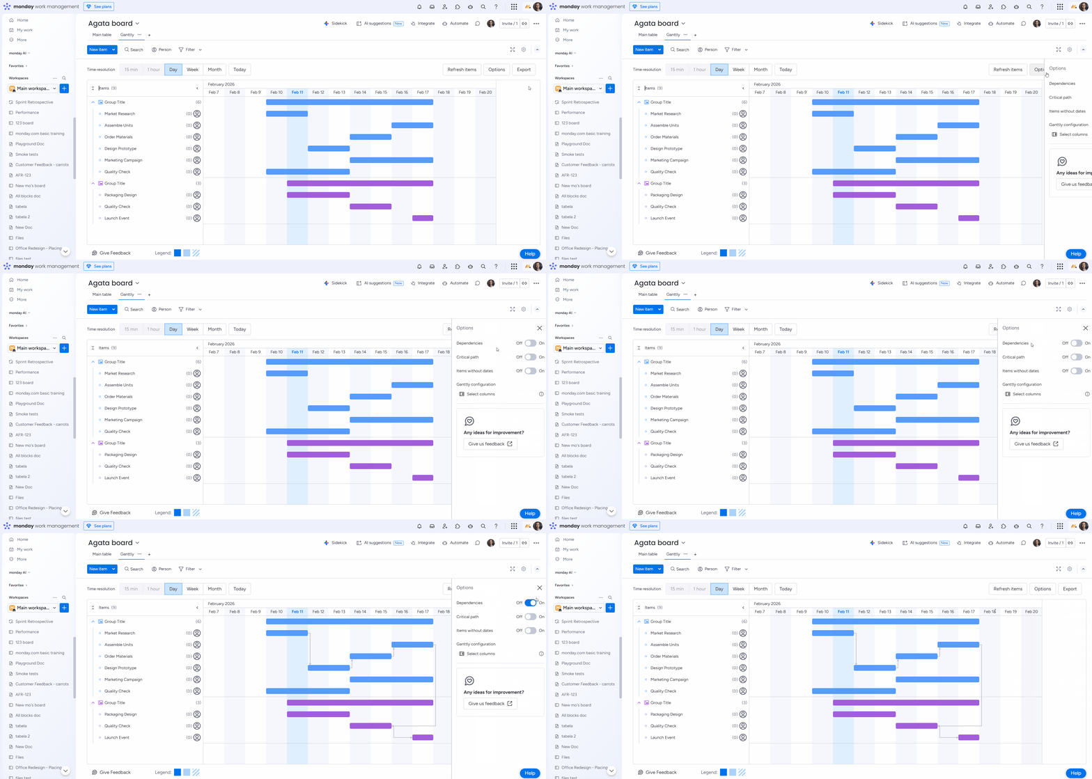
Items linked via a Dependency Column are represented by gray arrowed lines that link the tasks together. The arrow is directed from the dependent item towards the dependee item.
Interacting with the chart
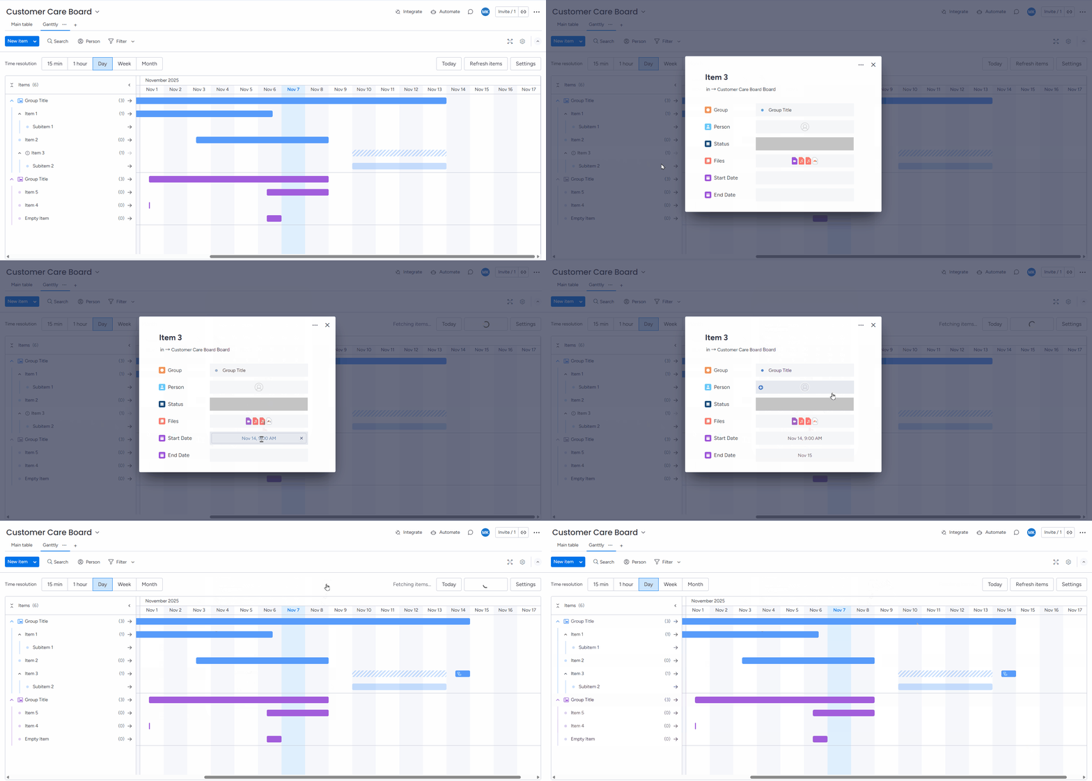
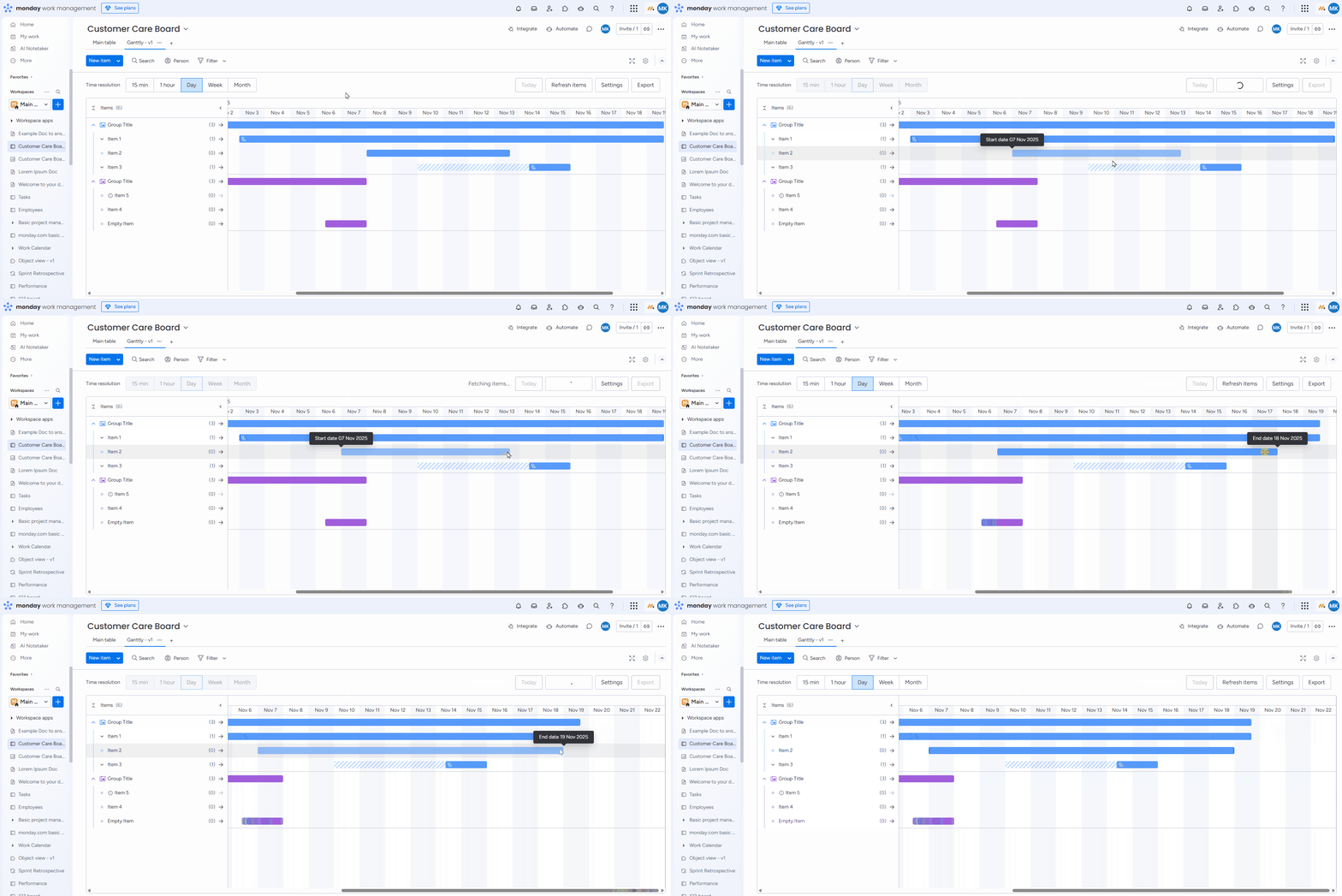
If you need to display item details, click on the item name in the item list. You can change the dates from the item details view.
You can also change the timeline of items by holding and dragging the item on the chart. When moving items this way, they will automatically snap to the grid you have set.
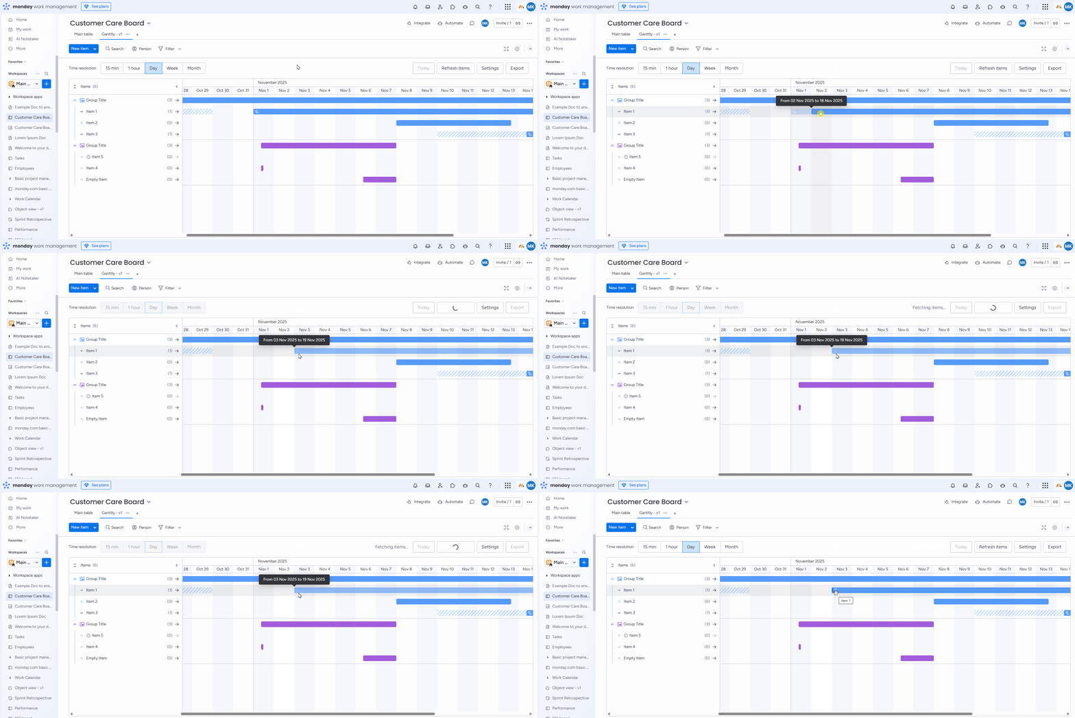
On the board, you can easily change the duration of the item by resizing the bar. Hover over the bar beginning or end to see the resize cursor icon. Hold the cursor to resize your item’s duration. When updating items this way, they will automatically snap to the grid you have set.
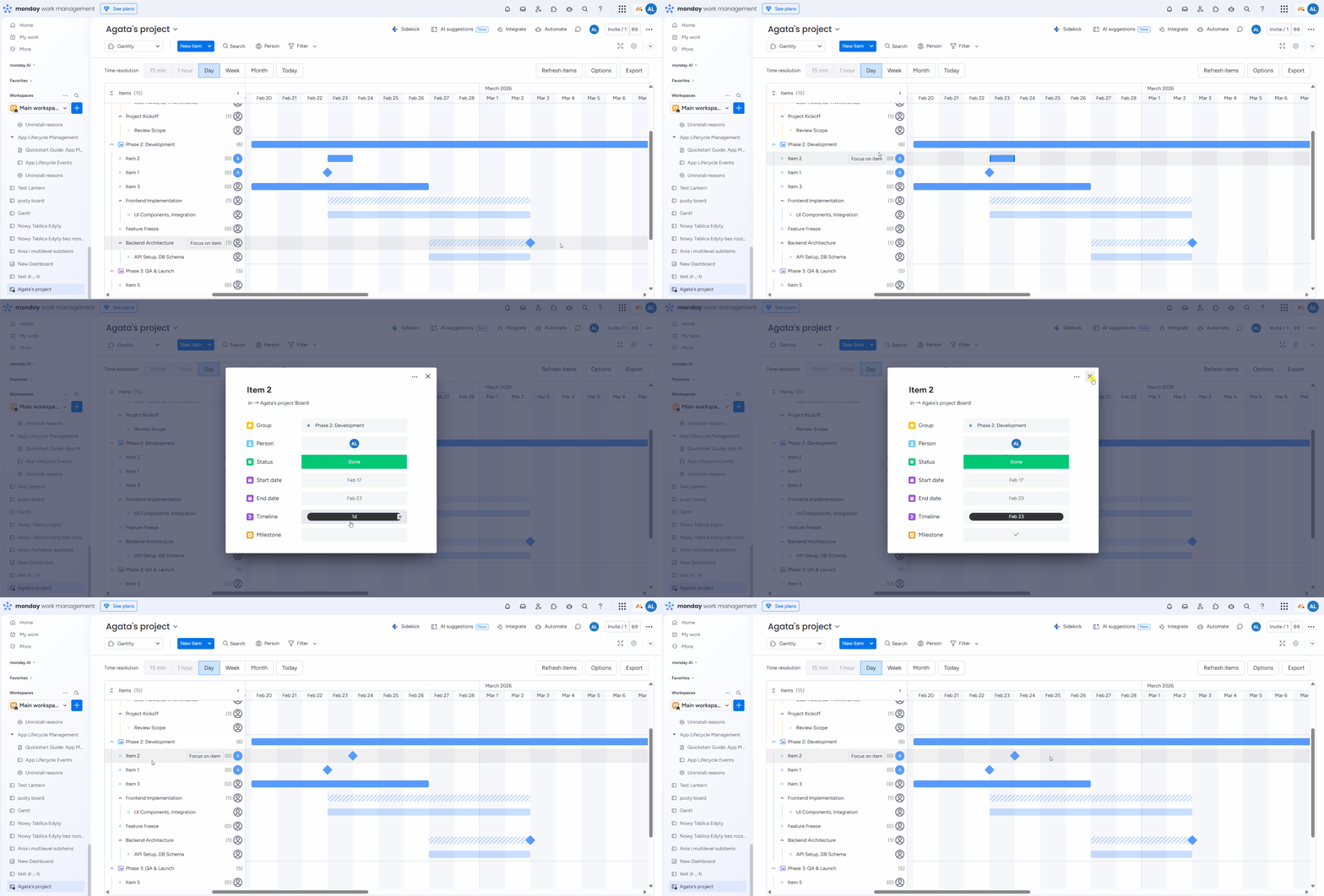
You can also mark an item as a milestone from the item details view on the board, provided that you have a Checkbox column added and mapped to milestones in your settings.
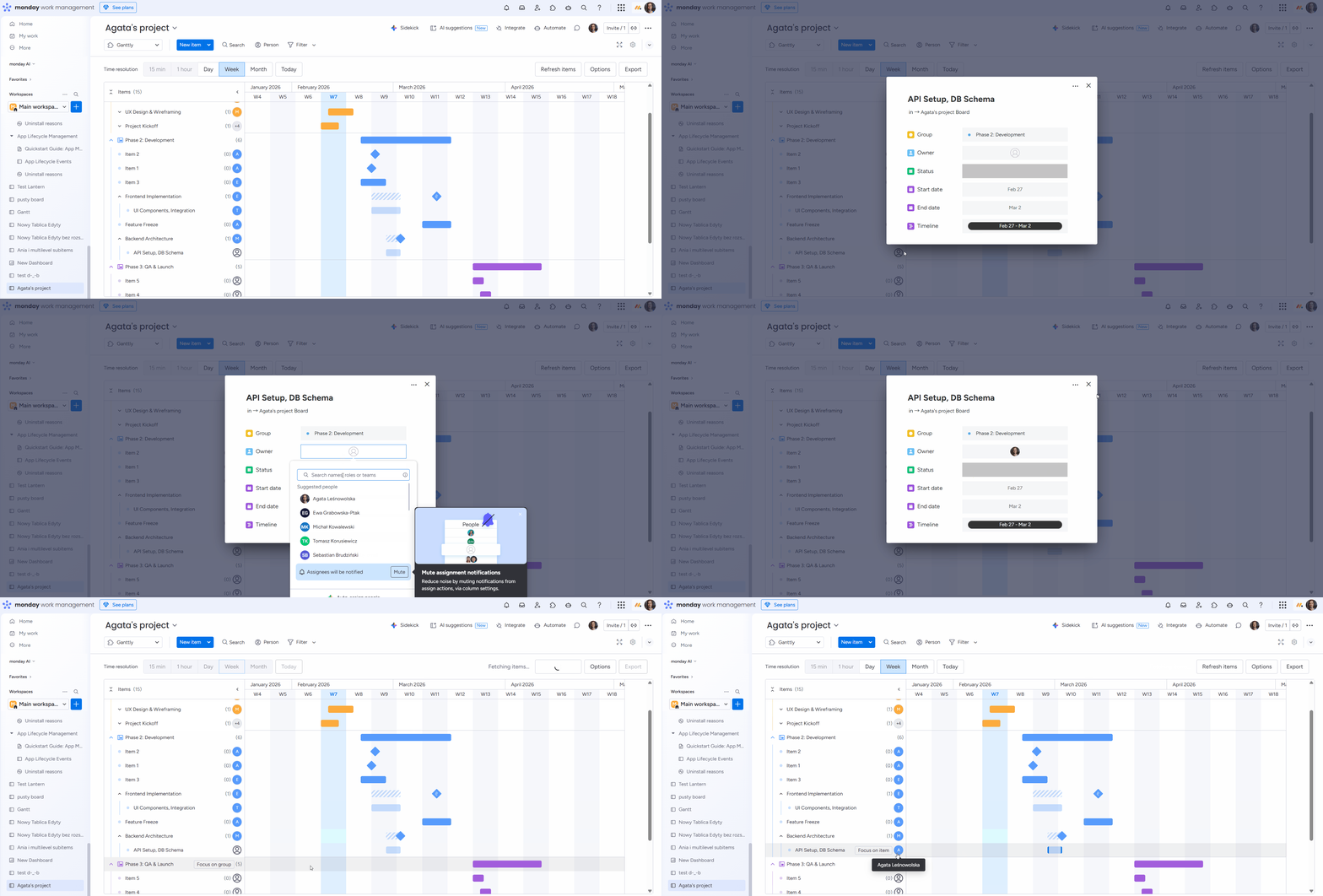
You can add people to the People column directly from the item details view without switching back to your board.
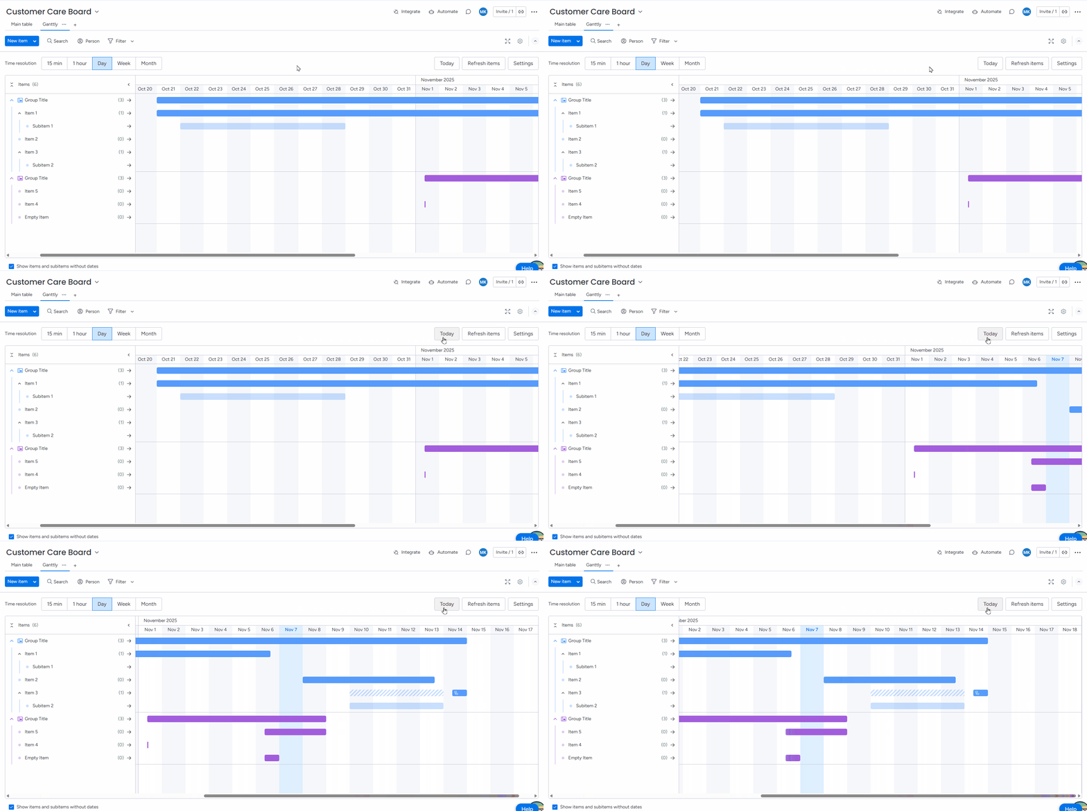
Click “Today” to instantly scroll to the current day on your chart.
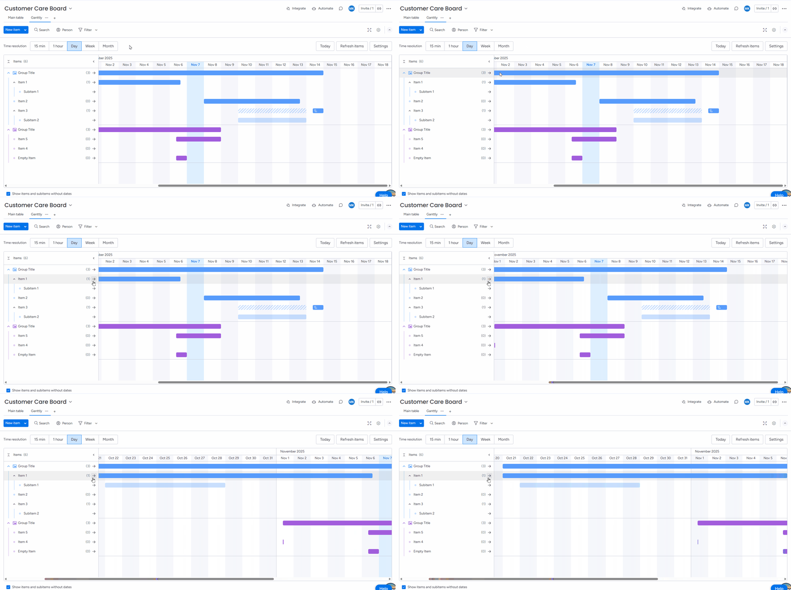
Click on the arrow icon next to the item name in the sidebar to scroll directly to it.
Filtering
By using the search & filter functions, you can display only specific items on the chart.
There are two types of filters you can apply:
Quick Filters
.png?cb=bd13967c129feacdf8a4c5dcb33db852)
Advanced Filters
.png?cb=c0b39312e47d52c6bf09dbd4aa0646b8)
Display options
In the top-right corner of the Ganttly interface, you will find the Options button. Selecting this button will open a drawer on the right side of your screen, containing settings to customize your chart view.
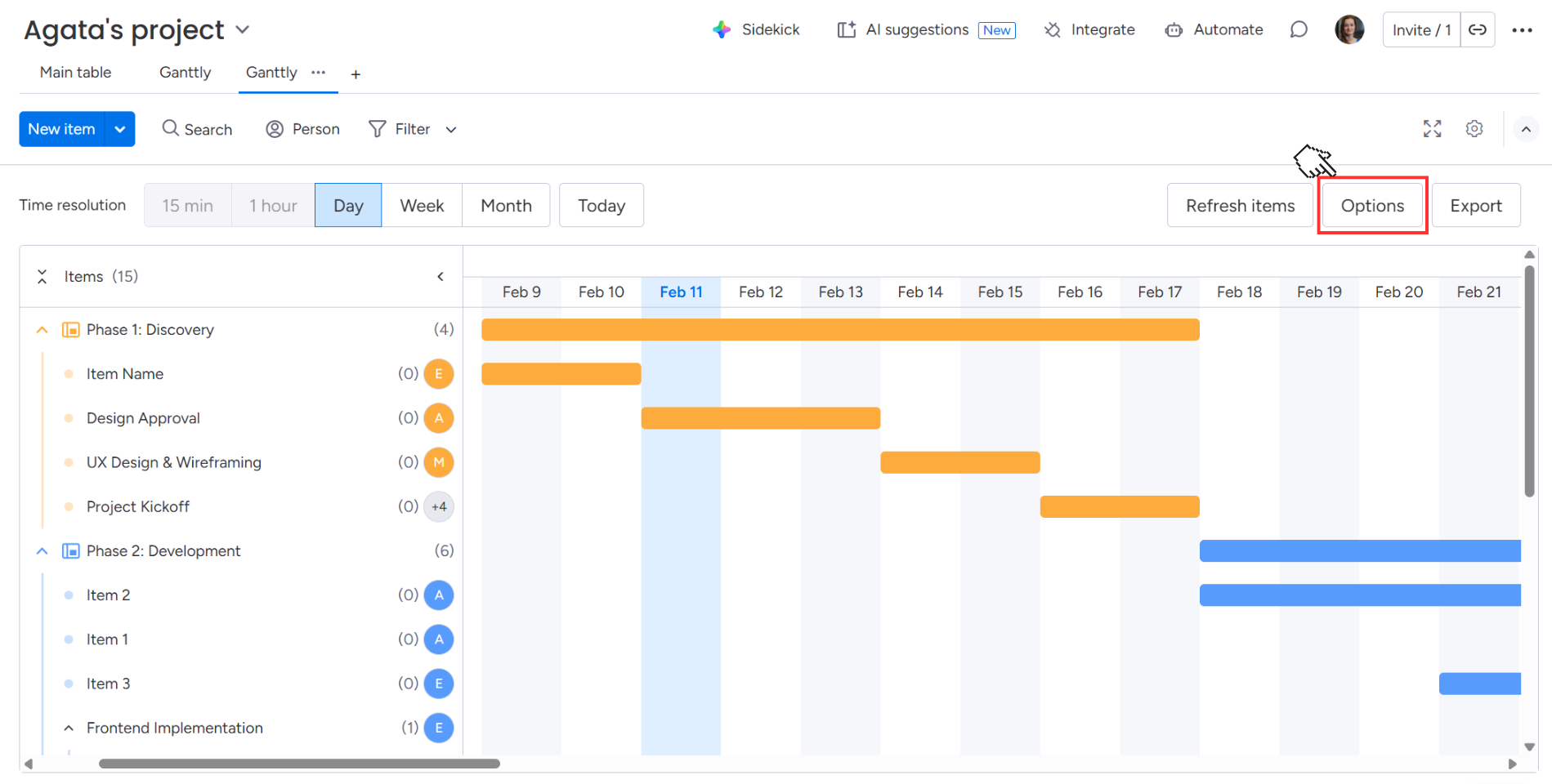
From here, you can:
-
Enable or disable the visibility of dependencies on your chart.
-
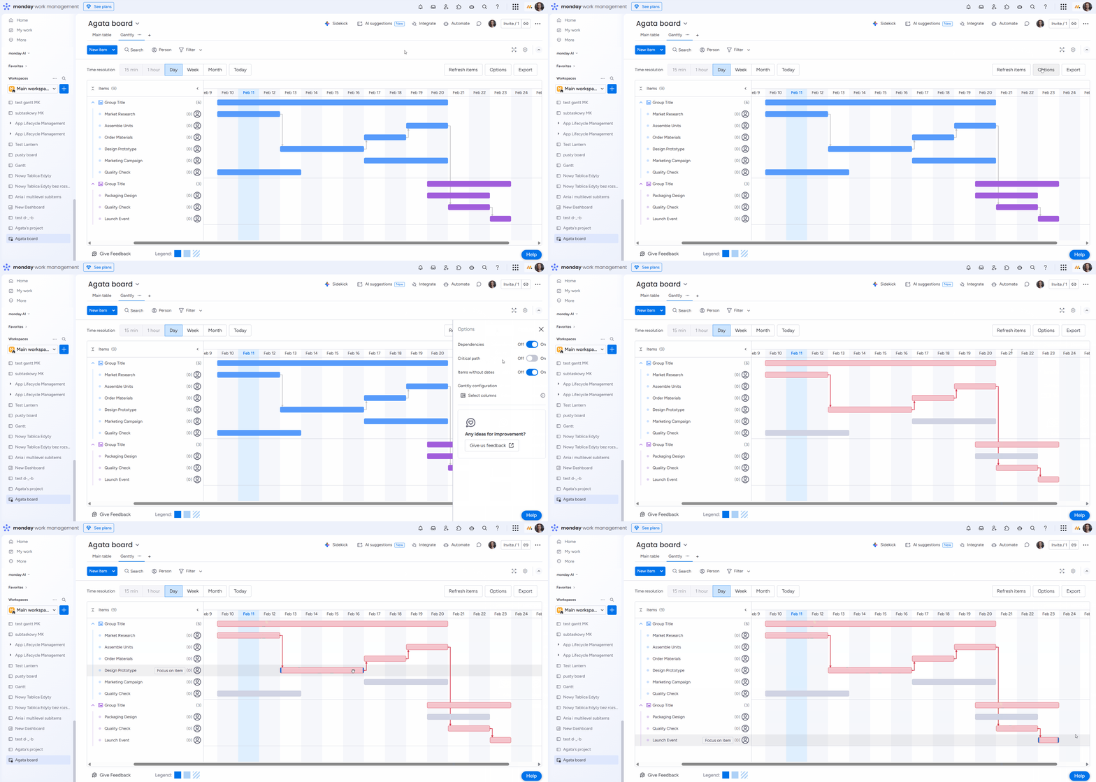
Activate the Critical path toggle to highlight the sequence of tasks that determines your project's duration.
-
Decide if you want to display items without dates.

-
Go back to the Ganttly configuration and change the column mapping.
Critical path
The Critical Path feature helps you identify the sequence of tasks that determines the overall duration of your project. See here a detailed instruction on how to visualize the critical path on your board.
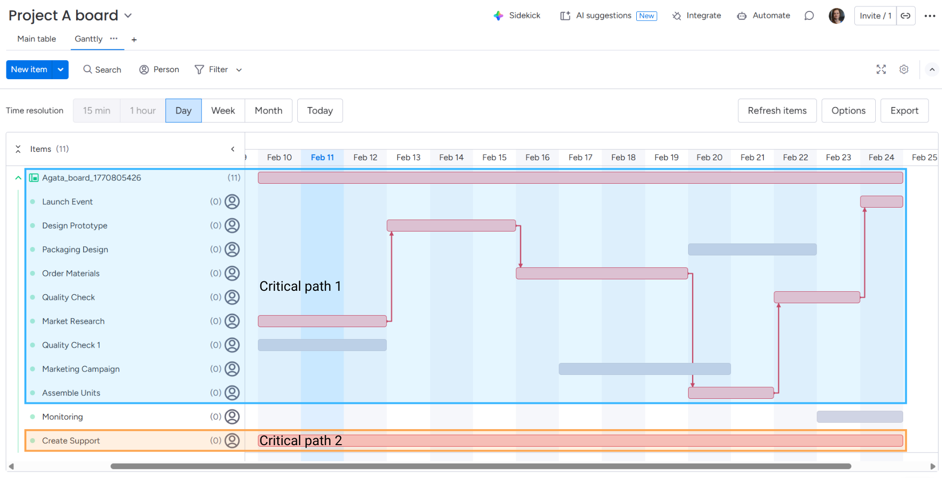
Toggle the Critical Path option within the Options menu to highlight the most vital tasks on your board. When active, the tasks forming the critical path are highlighted in red.
Your board can display multiple critical paths simultaneously if each path meets the necessary requirements.
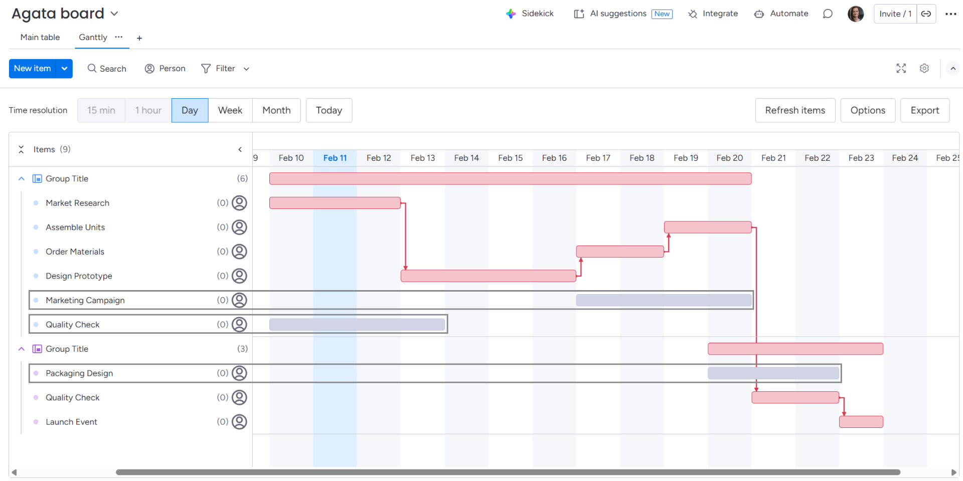
If an item is not on the critical path, its bar will appear gray while the toggle is active.
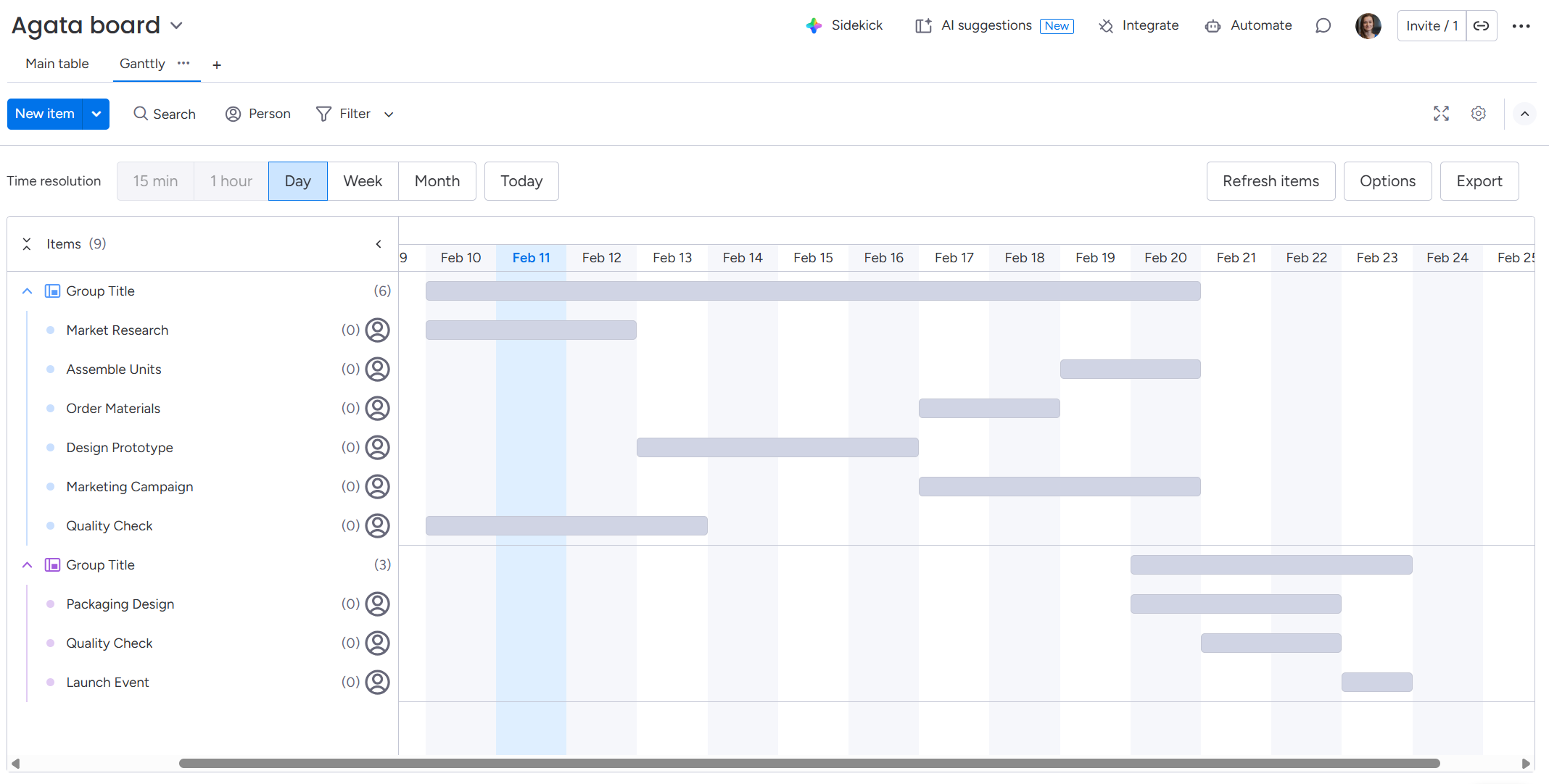
If the option is toggled on but your project does not currently have a logical critical path (e.g., due to missing dependencies), all item bars will turn gray.
Export
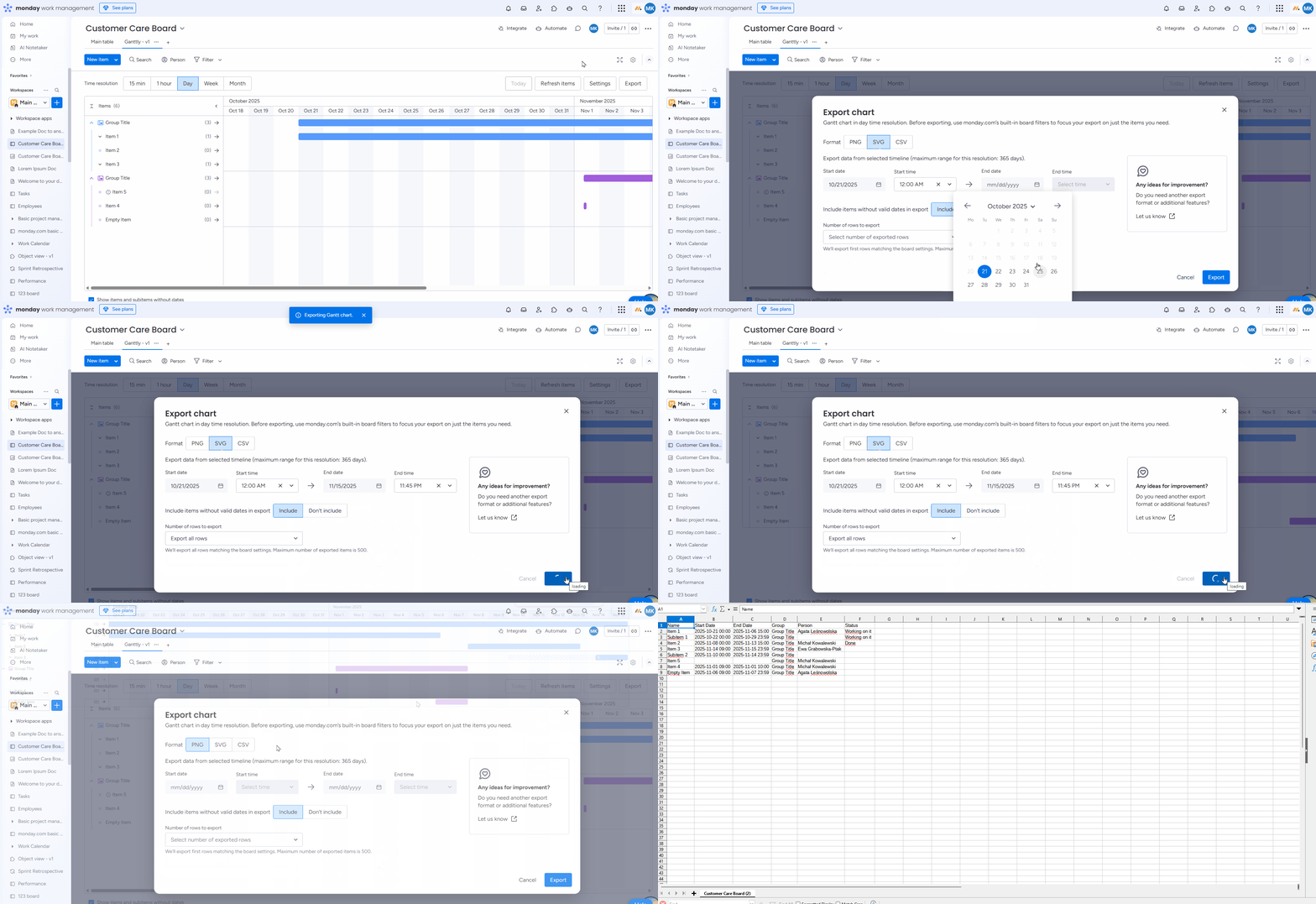
You can export your chart to the following formats: PNG, SVG, and CSV.
Click on the Export button and determine the settings.
-20260102-115951.png?cb=96051fc30f953c2a42ee9784203fd1a7)
Choose the format of the exported chart. If you want the chart to be saved as visual graphics, go with PNG or SVG. If you want the chart to be presented as data, go with CSV.
Choose Start and End dates/times. The maximum range for this resolution is 365 days.
You can also include items without valid dates in the export.
Lastly, determine the number of rows to export.
Once you have everything, click on the Export button to download the chart.
Export limitations
The available export range depends on the selected time resolution. Due to performance and browser limitations, the following limits apply:
-
15-minute resolution: export is limited to up to 7 selected days
-
1-hour resolution: export is limited to up to 30 days
-
1-day resolution: export is limited to up to 12 months
Additionally, you can export up to 500 items at once. This limitation is related to browser capacity and helps ensure a stable export performance.
Split view
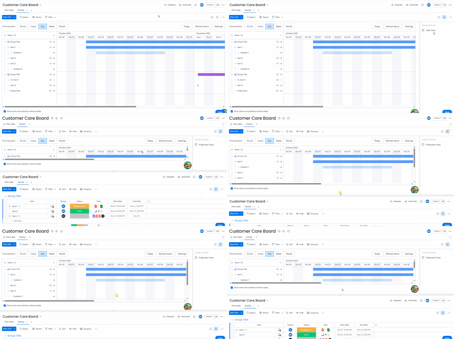
You can use the Split function to view your Gantt chart and board side by side. You’ll find it under the cog icon.
Fullscreen view
You can enter a fullscreen view by clicking on the expand icon (two diagonal arrows) located in the top-right corner of the interface.